
Martech
Growth Operations
Expand
Optimize performance and reduce technical debt. Ideal for efficiency and fine-tuning.


Evolving a design system in Figma comes down to a few steps: centralise everything into one master file as the single source of truth, seed it with structured categories, and route new components through a defined contribution process, such as request, review, approval, testing and deployment. Without that structure, teams can create local duplicates and components go out of sync.
For modern digital product teams delivering omni-channel experiences, a scalable design system in Figma helps maintain high quality and speed. However, as brands grow so do design language needs. Components must continually evolve without fragmentation.
In this guide, we break down practical steps for updating established design systems in Figma systematically while avoiding capability dilution across dispersed teams contributing new elements.
Design systems embed libraries of reusable UI components, patterns, guidelines, code snippets and samples allowing product teams to roll out consistent, cohesive experiences faster.
Core benefits include:
Efficiency: New feature builds reuse existing branded elements like buttons, cards and widgets instead of reinventing every time. This boosts team velocity.
Governance: Centralised components updated in one source can reach every file that uses them.
Agility: Abstracted elements allow designers and developers to focus purely on assembly and logic instead of repetitively crafting standard ingredients every sprint.
However, realising this productivity hinges on nurturing design systems as evolving platforms supporting contribution from specialists across multiple product squads in a structured manner.
Common Issues With Neglected Systems
Outdated Components: New styles not added to main libraries. Everyone starts using their own custom components deviating from approved elements. Inconsistencies & extra work.
Forked Instances: External teams sometimes create local duplicates of the design system instead of using the latest from the central source. Components go out of sync causing costly migrations.
Abandoned Guides: Design principles & style guides with no designated maintainers accountable for governing system. Brand erosion across channels kicks in slowly.
Difficult Access: Core component suites not shared conveniently or amplified. Engineers unable to harness design libraries. Everyone leans on makeshift solutions without structure.
Here is a workflow for maintaining and contributing to an enterprise design system built in Figma.
Consolidate all existing components tagged appropriately into one Golden Master template file hosted on Figma. This serves as the single source of truth moving forward. Announce this to all designers and engineers using the system.
If multiple legacy systems of mismatched fidelity exist currently, pick the instance with newest and widest adoption to build upon. Retire outdated duplicates incrementally post migration to prevent regression risks short term.
Clearly segregate mature vs incomplete components using status tags like:
Categorise elements using consistent naming like Button / Chart / Card / Widget and numbering. This organisation aids discovery and transparency on maturity.
Beyond isolated UI components, incorporate structure providing context on how elements combine into higher order composites under categories like:
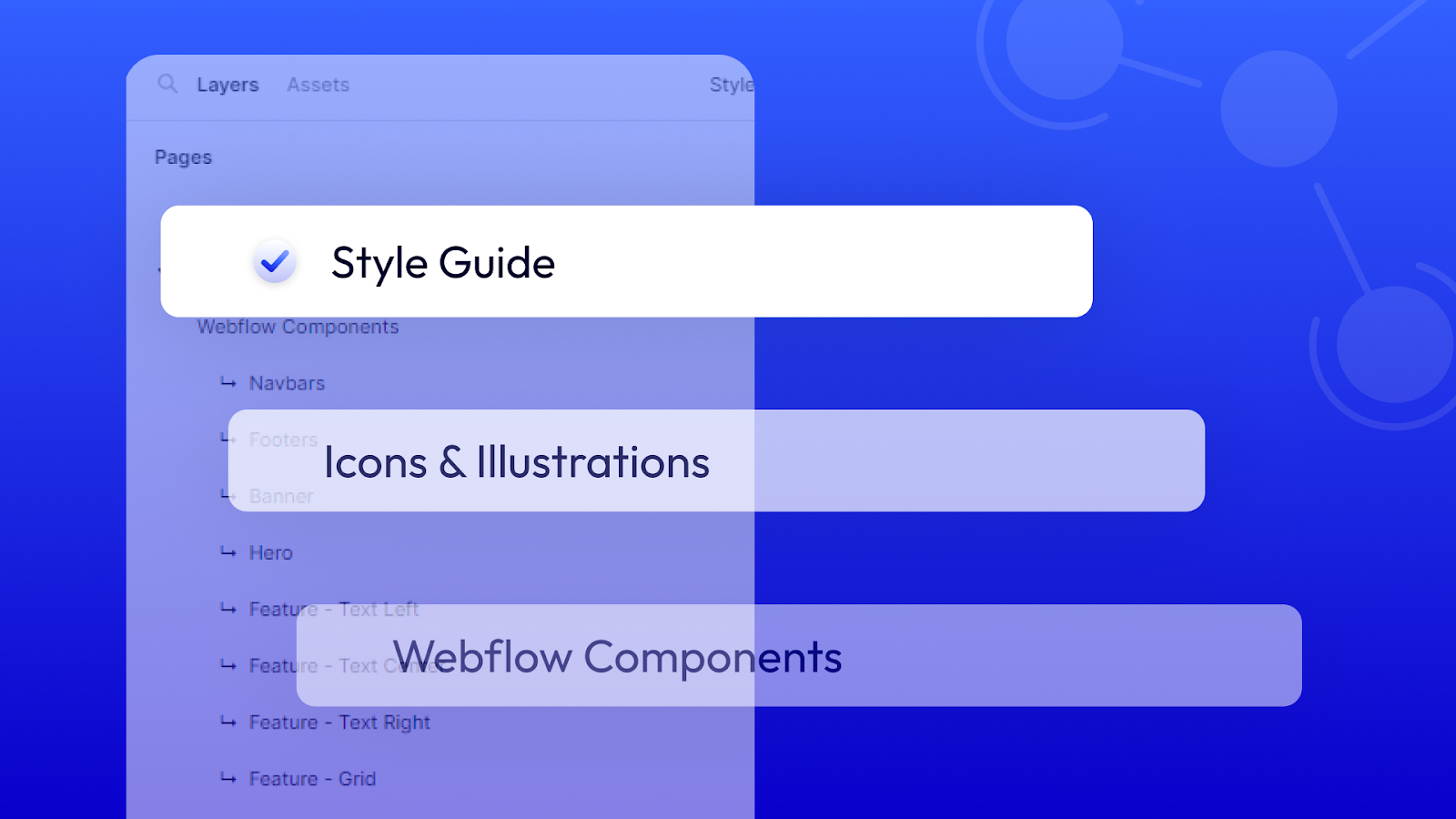
Curate content fitting key domains like promo sites, self-serve portals, admin tools etc across individual pages reinforcing component context.
These composites boost efficiency during wireframing when translating ideas to screen designs leveraging real combinations pre-built speeding business model conceptualisation. They also serve as handy references keeping implementations on-brand.
To avoid fragmentation from designers independently introducing components, define a structured protocol for proposing additions with appropriate validations built-in.
For example consider a workflow like:
Request: Designer fills a proposal form detailing the capability gap being addressed with the new component + specifications
Review: Cross functional team provides feedback accounting for technical feasibility, branding fit, redundancy risk and roadmap alignment
Approval: If endorsed, designer builds component to specifications on a sandbox page in Master design system file
Testing: Review team inspects sandbox builds before tagging “Ready for Publishing”
Deployment: Approved components finally get moved officially into relevant categories as “Production” elements everyone can leverage
Transparency over new versions also comes from appending dates or version numbers to component names like Button_V2.
Atlassian has documented this approach to structured design system development in detail.
Recommendation from Admiral Systems
To manage design system contributions, teams can use Notion as a central workspace allowing cross-functional teams to collaborate. Designers submit proposals for new components by filling out a Notion form detailing user needs and specifications. These submissions feed a Notion database where reviewers can provide feedback on feasibility and branding alignment. Approved proposals get tagged for production by designers within a Figma sandbox. Notion keeps all stakeholders aligned allowing structured vetting and testing prior to official component publishing. With one workflow across Notion and Figma, teams establish accountability, and distributed contributors can help evolve the libraries.
Once the Master Design System matures containing thoroughly tested categories of elements sufficient for majority prototyping needs, share certain component suites as published libraries in Figma so everyone has easy access without actually modifying the source.
Published libraries let other files use their components, while the originals stay in the source file. They serve as neatly organised distribution mechanisms for elements deemed stable especially when collaborating with external partners to provide UI kits.
Changes need to happen first only in the Master file. When ready for release, updated libraries can be published, and consumers then pull the latest version.
This helps prevent external teams forking components independently when dependent on certain elements provided by central design teams.
With a robust Master source powering published libraries for easier adoption across business units, double down on removing redundant components created earlier at individual levels.
Proactively clean up via:
Continual effort to consolidate adoption on centralised libraries pays off over quarters. Not only does consistency improve but documenting and maintaining components becomes more manageable for design teams with fewer fragments to govern.
Attention shifts instead from replication to innovation for designers having to produce fewer and fewer base elements from scratch each month.
To proactively reduce needless duplication born from lack of awareness on existing elements packaged for adoption, host occasional working sessions showcasing newest additions and gathering feedback from production teams on potential gaps worth formally filling via new approved components.
This facetime builds familiarity with possibilities out there speeding up exploration for designers at individual levels while allowing fresh UX challenges to percolate bottom up helping shape Master system expansion priorities next season.
Over time, these sessions improve transparency and build a stronger sense of ownership over shared resources, so designers are more likely to use standard elements instead of building from scratch.
With sustained effort, design systems evolve from rules imposed top down into platforms that draw contributions from specialists across product squads, rather than being controlled by only a few stewards in isolation.
This culture supports greater speed and new ideas.
Recommendation from Admiral Systems
To amplify design system adoption across distributed product teams, central UX teams can use Loom to publish video tutorials showcasing new components and patterns added regularly. These short, friendly tutorials walk viewers through practical applications of elements while sharing best practices. Designers can reference the videos on-demand instead of scheduling live workshops. The videos add to the written documentation and help new joiners learn faster without direct hand holding. New hires can then find and apply existing components early on through the Loom tutorials.
While Figma fuels rapid prototyping, integrating UI libraries into deployment-ready sites traditionally causes rebuild overheads for developers. New tools narrow this gap.
The Figma to Webflow plugin, published by Webflow Labs and approved by Webflow, connects a Figma design system to the Webflow app. It exports Figma layers to Webflow components and elements, Figma variables to Webflow variables, and Figma text and effect styles to Webflow classes.
After the import, you add these components to Webflow Collection Lists and connect your CMS data to their properties, in Webflow. Pages then fill from real content, not mock data.
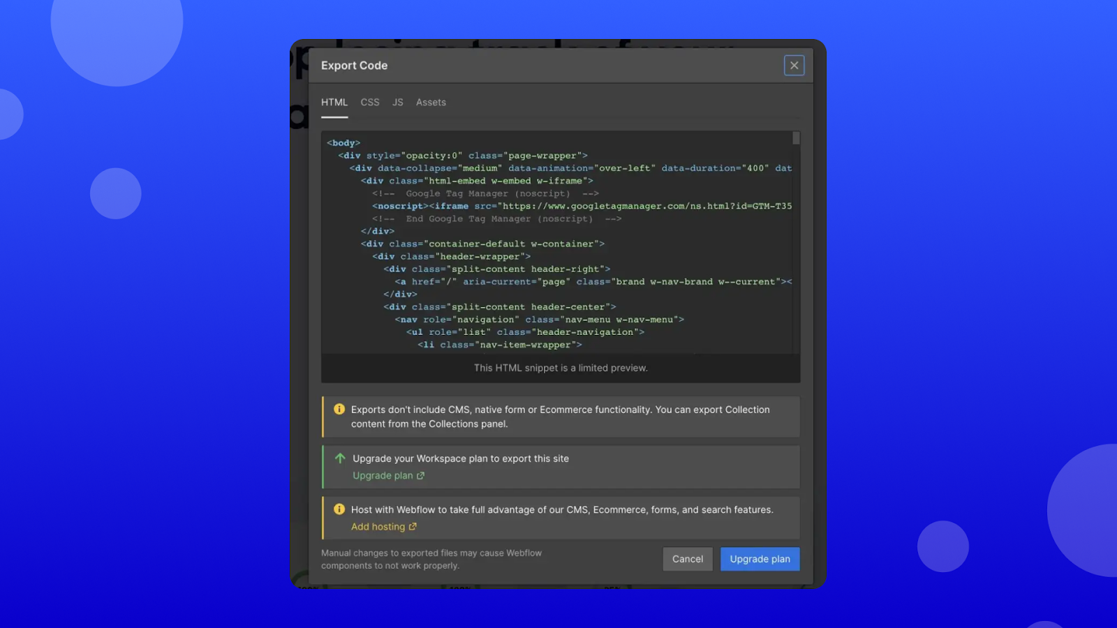
When Webflow CMS needs added flexibility, exported component code keeps a configurable structure that developers can extend.
In summary, the Figma to Webflow plugin and app let teams bring Figma layers, variables and styles, already reviewed by designers, into Webflow for consistent implementation.
Ultimately for multifunctional product teams shipping experiences at scale, evaluating ideas and organising workflows through the lens of configurable components abstracted from implementation mechanics represents the sustainable mindset progression needed.
This shift challenges siloed specialist attitudes and requires early collaboration, treating solutions as combinations of reusable elements instead of one-off builds solved in isolation each time.
When teams set up owners, pipelines and platforms that treat enterprise-grade component libraries as products in their own right, outputs align more consistently with customer expectations and individuals get more room to innovate.
While Figma offers flexibility for collaborative interface design across dispersed product teams, Webflow is a no-code toolkit that unifies design to development.
Let's explore a workflow that uses both platforms together and builds on a centralised design system.
Exporting production ready components from mature Figma libraries into Webflow for consistent cross-channel engineering follows these steps:
Bundled styles and patterns organised thoughtfully as a published library in Figma enable controlled downstream consumption without risking source file contamination. This allows Webflow designers access to permitted elements from the source Figma system.
The plugin converts Figma auto layout frames (Figma’s rule-based layouts) into responsive flexbox structures (web layouts that resize with the screen). In Webflow, the team then opens the Figma to Webflow app and imports the layers, variables or styles it needs.
Imported components can go on CMS Collection page templates in Webflow. A template uses one layout for every item in a Collection, so one design can serve many pages with the same structure.
When advanced scenarios demand added code flexibility beyond Webflow CMS capabilities, exportable component markup keeps a configurable structure that developers can build on.
Figma leads design direction and Webflow leads execution. Teams share one source of truth, and feedback from real use continually improves the libraries.
This guide has covered how to evolve design systems and component libraries using Figma, Webflow and connected automations. Here is what matters most to Admiral Systems:
To help clients get lasting value from their platforms, not just a one-off launch.
Too often, we see vendors deploy basic digital assets for clients without enough focus on maintenance or lasting adoption.
Admiral Systems instead focuses on building foundations for long-term growth through:
Too often, company leaders see design systems as optional rather than as essential infrastructure.
Admiral Systems aims to help enterprises that want to transform digitally put the customer at the centre.
If your team wants a design system that scales with your product, without the fragmentation, we can help you get there.
Book a call with our team to scope where to start.
Find the right engagement fit for your current need(s)
Go to Market
Consulting
Validate ideas with market research, strategic planning and prototyping. Ideal for exploring new concepts.
Martech
Implementation
Launch Low-code MVP or Custom Interactive websites with user-focused design. Perfect for quick market entry.
Growth & Marketing
Campaign Experimentation
Boost growth with scalable systems and marketing automation. Suited for advanced analytics and more.
For teams with a bigger appetite for growth
Martech
Transformation
Transform with system modernization and integration. Best for comprehensive digital change.
Martech
Growth Operations
Optimize performance and reduce technical debt. Ideal for efficiency and fine-tuning.

Enterprise Singapore sets the rules and can change them. In general, you need all three of these before your project is assessed.

The grant is run by Enterprise Singapore for companies registered and operating here.

You need to have sufficient funds available to pay for the entire project upfront.

You need a defined project with real deliverables, dates, and outcomes.














We can't wait to hear all about your game-changing ideas. Spill the tea!

Be the first to know on further updates on Growth contents for your organisation, don't miss out on our sneak peaks and exclusive community contents!